Record of feedback from paired discussions and group crits
Eleanor
The first paired crit came almost before we had begun our work for the Studio Practice unit. What was really useful was E. and I were able to discuss our reflections from the previous unit and begin to collaboratively formulate strategies to tackle the next unit. The key issues I felt had been raised from the exploratory project were as follows...
I needed to extend and refine studies rather than moving between multiple ideas. This had been rather a bone of contention for me in my feedback as I felt it was contradictory to the feedback I had received during the Exploratory Project. However, I identified a need to refine and develop my practical skills so decided to investigate glazing techniques in order to become a better painter.
In addition there were a number of aspects of my practice which I felt had been a success in the Exploratory Project, so we discussed how I could take these forward. These included using different viewpoints, including the whole figure and developing context by placing figures in an environment.
We also discussed how to manage blog entries and I decided that I would generate 10 posts which would run simultaneously as lines of enquiry through the project, to include paintings, contextual research and practical methods.
Group Crit
Statement - good use of visual words (JK)
well written, the best of the four (CP)
“…am interested in the notion of fluidity both in media and character” not sure what was meant by this (JK)
I read this as Alexa not doing straightforward portraits (CP)
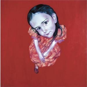
Macabre – yes, playful – not sure about this (the first one is just dark), dont see anything in relation to sugary colours. 2nd
image more playful, in part due to the pose of the central character
and also because of the playfulness with scale (birds), character on
left is macabre/dark again, has an ambiguous background
3rd image ��� very, very dark, not really a human child at all, more like a creature, and the hunched cramped-ness is dark (CP)
The work is threatening (EB)
Scale
and tension – the heads are always too big for the bodies- the
characters are ‘in your face’ but the colour does not create a sugary
façade (JK)
Not sue if the fact that the litho image is a print is what makes it darker (CP)
it is more about the marks they are scratchy (JK)
It is also about the use of space, creating a sense of menance (EB)
Also it is the cropping of the head, it’s a sense of scale (JK)
The first images is sinister for another reason they look like children but in fact their poses are provocative and coy (CP)/The white oval shapes are eggs (EB)/The eggs are a bit lost (JK)
The
litho offers a very good method to explore the narrative and character
in the works, the process of the transfer of images from stone to paper
offers the opportunity to explore the quality of line ands the starkness
of b/w work, do more! (CW)
Characters are alive and fluid – by contrast the bird appears inert, rather lifeless (EB)
The people have volume, the bird is flat, like decoration (EB)
Wonder if Alexa drew the bird from life or from a photograph? (CP)
Reflection
Although it would have been better if I had been able to attend the crit, I feel that the comments were quite perceptive and are starting to refer aline with my intentions. I think I made an error with the placing of the bird as it has created a problem with the space within the painting as it was supposed to be outsized, but instead appears as something in the immediate foreground. I haven't decided how to deal with the 'eggs' yet but am going to leave them until I have resolved more of the painting - I feel that they should be negative space but this should add to ambiguity, not just appear random of forgotten. I am definitely going to make more prints but have a issue with equipment and access to a printing press at the moment. I really think that the drypoint works well to draw out a more intense, psychological message from the figure. However, I am unsure as yet about where this fits with my current body of work and focus on painting, except for the general development of technical knowledge. There may be a link with Paula Rego's graphic works...
Amelia
I had made huge progress with my work since the initial paired crit with Eleanor, so my discussion with Amelia was really positive and motivating. We discussed the process that I had used to work into my paintings and had I had tried to really push the work further than I was comfortable. Amelia said that she found the girl with the wings really engaging because of her direct gaze. She observed that the paintings weren't as ethereal - the denser colour seemed to make them more substantial. She said that my work before was more transparent and transient, these pieces more meaningful, less fleeting. She felt that I hadn't lost the elements which worked but that my ideas appeared more formed. We discussed how I had responded to Caroline's process of building up and taking away elements - although this is very difficult to do with painting, I have photographed each stage and continued to push the work by building up layers. In a sense, if I push the work too far, I am prepared to accept that as part of my learning process. Amelia loved the saturated colour and the way the figures appeared goblin-like, the characters more fleshed out and intriguing. I felt that this crit was extremely positive and gave me the first feedback that I had had about the new developments.


For the group crit I presented the latest photographs of the three paintings. We talked about the significance of leaving the eggs blank - I had left these as spaces as I wasn't sure whether to paint them as I was cautious of them becoming decorative. Through discussion we established that the blank spaces reinforced ambiguity and made the scene more awkward, which was positive. They could also reference the idea of treading on eggshells and the figures' 'odd, cracked personalities'. We talked about the playing children painting and how the bird seemed to be floating with undefined feet. This created an unsettled intention and made the 3D space unconvincing, with the girl and bird fighting. I had intended to make the space seem tangled but this wasn't communicated clearly, so I need to address the spatial aspect of the composition. J suggested that I look at Hockney's Old Masters series to investigate practical methods. C said that the girl in the tree house painting looked like she was wearing a tattered hunting coat. We discussed the horizon which seemed to cut across the girl's shoulders. I have since obscured the harsh line with beginnings of a tree supporting the house. C said that it reminded her of Louise Bourgeois' 'Femme Maison' which I am going to investigate. Angela suggested that I also look at anime characters who have shape shifting powers - I am quite intrigued by the idea of joining figure with other structures or forms, this made me think of the research I did into the Doppelganger book which I will re reference. I also intend to read 'The Uses of Enchantment: The Meaning and Importance of Fairy Tales' by Bruno Bettelheim as a result of this crit.
James
James and I had a really positive dialogue about both of our bodies of work. This was particularly useful as we both had made developments in our work but hadn't directly critiqued each other so our discussions were fresh and stimulating. James felt that the quality of the glazes created a 'sadonic' effect and that despite the primary colours, there seemed to be a sinister underlying message. We talked about the corn image which James felt showed deformity because of the cropped arms and hanging legs, and how there was a subtext to the fairytale-like imagery which made them creepy and violent. James felt that there was a clear link between my work and the images I had attached through viewpoints and spaces which tricked your eye. My intention to place the audience in a different viewpoint is starting to work as the viewer is not sure where they are looking from making the work confusing and intriguing. We talked about playing with age of the characters to create a sense of unease - James felt this was particularly present in the corn painting where the clothes and position of the figures is childlike but the expressions are much older. I am intending to work into the face of the girls in the 'fairy' painting to add a sense of ageing. If their age and identity is unfixed, the characters may be easier to identify with, or will encourage the audience to project their own experience whilst engaging with the work. James felt that Nicky Hoberman was a really good reference for my work as her paintings provoked a similar reaction and she deals with dis figuration through the positioning of her models. Although she is largely using coloured backgrounds rather than context, I respond to the way she explores the gaze and manipulates the figures. In response to Angela's comment about the artist references not capturing the same 'profound psychological impact' (except for Francesca Woodman), we discussed possible other painter references including Marlene Dumas, Lucian Freud, Edvard Munch, Francis Bacon and Jenny Saville. I am going to revisit these artists to see if there are links that I can make. We also discussed the physical space in the paintings and how it was convincing because of the perspective. I am going to print some more photos of the up to date paintings to work on top of to try and resolve the space problem, as this was an effective way of working before.
Claire
It had been quite a while since Claire and I had spoken one-to-one, and we had both made leaps in our work so this was a very constructive conversation. We spoke about the petals I had added which suggested the wallpaper wilting. Claire thought this worked well and that it added to the cluttered and cramped appearance. We talked about the cropped bird and how this added disharmony which now seemed to work; it was an early compositional decision I made and has grown into a challenge; it now has 'lovely solidity'. We discussed the woollen sleeves I have added recently; Claire said they reminded her of rhino skin or an insect as they appeared armoured and mechanical. I'm really pleased that she felt they were evocative of different conceptual ideas rather than just clothing as I intended the figure to be brought even further forward. The feet of the girl on the right are still unbalanced - we agreed that this was because of the blue around the heel which made the foot disjointed from the floor. I am going to glaze over this to hide the blue so it's more cohesive with the ground. After talking about the triangular composition in this painting, Claire felt that as a viewer you were stuck in the frame because of the gaze of the different characters, making it claustrophobic. We spoke briefly about the weird little creatures in my corn painting, and how the eggs are more nested because of the gestural strokes of broken straw. I am still having trouble with the hand, it looks dead but I am waiting to glaze yellow ochre over it to warm it up. In fact I think it looks prosthetic which is something I may play on. Claire found the little circles on the pirate top visually confounding - they reminded her of flesh cut open and held her attention; I hadn't thought about flesh but added the detail to break up space which wasn't working with the rest of the figure. I only have two weeks left of making so am going to try to address the issues raised in this crit before drying time commences.
Amelia
I had made huge progress with my work since the initial paired crit with Eleanor, so my discussion with Amelia was really positive and motivating. We discussed the process that I had used to work into my paintings and had I had tried to really push the work further than I was comfortable. Amelia said that she found the girl with the wings really engaging because of her direct gaze. She observed that the paintings weren't as ethereal - the denser colour seemed to make them more substantial. She said that my work before was more transparent and transient, these pieces more meaningful, less fleeting. She felt that I hadn't lost the elements which worked but that my ideas appeared more formed. We discussed how I had responded to Caroline's process of building up and taking away elements - although this is very difficult to do with painting, I have photographed each stage and continued to push the work by building up layers. In a sense, if I push the work too far, I am prepared to accept that as part of my learning process. Amelia loved the saturated colour and the way the figures appeared goblin-like, the characters more fleshed out and intriguing. I felt that this crit was extremely positive and gave me the first feedback that I had had about the new developments.
Group Crit


For the group crit I presented the latest photographs of the three paintings. We talked about the significance of leaving the eggs blank - I had left these as spaces as I wasn't sure whether to paint them as I was cautious of them becoming decorative. Through discussion we established that the blank spaces reinforced ambiguity and made the scene more awkward, which was positive. They could also reference the idea of treading on eggshells and the figures' 'odd, cracked personalities'. We talked about the playing children painting and how the bird seemed to be floating with undefined feet. This created an unsettled intention and made the 3D space unconvincing, with the girl and bird fighting. I had intended to make the space seem tangled but this wasn't communicated clearly, so I need to address the spatial aspect of the composition. J suggested that I look at Hockney's Old Masters series to investigate practical methods. C said that the girl in the tree house painting looked like she was wearing a tattered hunting coat. We discussed the horizon which seemed to cut across the girl's shoulders. I have since obscured the harsh line with beginnings of a tree supporting the house. C said that it reminded her of Louise Bourgeois' 'Femme Maison' which I am going to investigate. Angela suggested that I also look at anime characters who have shape shifting powers - I am quite intrigued by the idea of joining figure with other structures or forms, this made me think of the research I did into the Doppelganger book which I will re reference. I also intend to read 'The Uses of Enchantment: The Meaning and Importance of Fairy Tales' by Bruno Bettelheim as a result of this crit.
James
 |
| Marlene Dumas - contrast, deathly, crumpled, gaze |
 |
| Francis Bacon - contorted, dark, muted, twisted, blurred |
 |
| Jenny Saville - raw, averted gaze, shadow, strained |
 | |
| Edvard Munch - vulnerable, dark shadow, closed body, | direct gaze, confrontational |
 |
| Lucian Freud - truth, light, focused, flesh |
 |
| Nicky Hoberman, distorted, gaze, high viewpoint, no context |
 |
| Balthus - Guitar Lesson |
 |
| Balthus |
Claire
It had been quite a while since Claire and I had spoken one-to-one, and we had both made leaps in our work so this was a very constructive conversation. We spoke about the petals I had added which suggested the wallpaper wilting. Claire thought this worked well and that it added to the cluttered and cramped appearance. We talked about the cropped bird and how this added disharmony which now seemed to work; it was an early compositional decision I made and has grown into a challenge; it now has 'lovely solidity'. We discussed the woollen sleeves I have added recently; Claire said they reminded her of rhino skin or an insect as they appeared armoured and mechanical. I'm really pleased that she felt they were evocative of different conceptual ideas rather than just clothing as I intended the figure to be brought even further forward. The feet of the girl on the right are still unbalanced - we agreed that this was because of the blue around the heel which made the foot disjointed from the floor. I am going to glaze over this to hide the blue so it's more cohesive with the ground. After talking about the triangular composition in this painting, Claire felt that as a viewer you were stuck in the frame because of the gaze of the different characters, making it claustrophobic. We spoke briefly about the weird little creatures in my corn painting, and how the eggs are more nested because of the gestural strokes of broken straw. I am still having trouble with the hand, it looks dead but I am waiting to glaze yellow ochre over it to warm it up. In fact I think it looks prosthetic which is something I may play on. Claire found the little circles on the pirate top visually confounding - they reminded her of flesh cut open and held her attention; I hadn't thought about flesh but added the detail to break up space which wasn't working with the rest of the figure. I only have two weeks left of making so am going to try to address the issues raised in this crit before drying time commences.


